6.0 KiB
Custom theme
Element uses BEM-styled CSS so that you can override styles easily. But if you need to replace styles at a large scale, e.g. change the theme color from blue to orange or green, maybe overriding them one by one is not a good idea. We provide four ways to change the style variables.
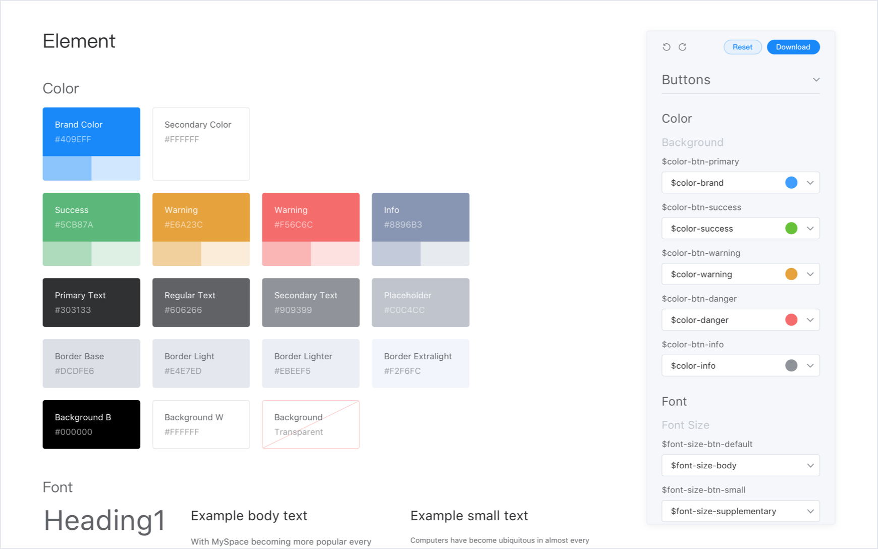
Theme Roller
Use Online Theme Roller to customize all Design Tokens of global variables and components,and preview the new theme in real-time.and it can generate a complete style package based on the new theme for you to download directly (to import new style files in your project, please refer to the 'Import custom theme' part of this section).
Also, use Theme Roller Chrome Extension,to customize theme and preview in real-time on any website developed by Element.

Changing theme color
If you just want to change the theme color of Element, the theme preview website is recommended. The theme color of Element is bright and friendly blue. By changing it, you can make Element more visually connected to specific projects.
The above website enables you to preview theme of a new theme color in real-time, and it can generate a complete style package based on the new theme color for you to download directly (to import new style files in your project, please refer to the 'Import custom theme' or 'Import component theme on demand' part of this section).
Update SCSS variables in your project
theme-chalk is written in SCSS. If your project also uses SCSS, you can directly change Element style variables. Create a new style file, e.g. element-variables.scss:
/* theme color */
$--color-primary: teal;

/* icon font path, required */
$--font-path: '~element-ui/lib/theme-chalk/fonts';

@import "~element-ui/packages/theme-chalk/src/index";
Then in the entry file of your project, import this style file instead of Element's built CSS:
import Vue from 'vue'
import Element from 'element-ui'
import './element-variables.scss'

Vue.use(Element)
:::tip Note that it is required to override icon font path to the relative path of Element's font files. :::
CLI theme tool
If you project doesn't use SCSS, you can customize themes with our CLI theme tool:
Install
First install the theme generator globally or locally. Local install is recommended because in this way, when others clone your project, npm will automatically install it for them.
npm i element-theme -g
Then install the chalk theme from npm or GitHub.
# from npm
npm i element-theme-chalk -D

# from GitHub
npm i https://github.com/ElementUI/theme-chalk -D
Initialize variable file
After successfully installing the above packages, a command named et is available in CLI (if the packages are installed locally, use node_modules/.bin/et instead). Run -i to initialize the variable file which outputs to element-variables.scss by default. And you can specify its output directory as you will.
et -i [custom output file]

> ✔ Generator variables file
In element-variables.scss you can find all the variables we used to style Element and they are defined in SCSS format. Here's a snippet:
$--color-primary: #409EFF !default;
$--color-primary-light-1: mix($--color-white, $--color-primary, 10%) !default; /* 53a8ff */
$--color-primary-light-2: mix($--color-white, $--color-primary, 20%) !default; /* 66b1ff */
$--color-primary-light-3: mix($--color-white, $--color-primary, 30%) !default; /* 79bbff */
$--color-primary-light-4: mix($--color-white, $--color-primary, 40%) !default; /* 8cc5ff */
$--color-primary-light-5: mix($--color-white, $--color-primary, 50%) !default; /* a0cfff */
$--color-primary-light-6: mix($--color-white, $--color-primary, 60%) !default; /* b3d8ff */
$--color-primary-light-7: mix($--color-white, $--color-primary, 70%) !default; /* c6e2ff */
$--color-primary-light-8: mix($--color-white, $--color-primary, 80%) !default; /* d9ecff */
$--color-primary-light-9: mix($--color-white, $--color-primary, 90%) !default; /* ecf5ff */

$--color-success: #67c23a !default;
$--color-warning: #e6a23c !default;
$--color-danger: #f56c6c !default;
$--color-info: #909399 !default;

...
Modify variables
Just edit element-variables.scss, e.g. changing the theme color to red:
$--color-primary: red;
Build theme
After saving the variable file, use et to build your theme. You can activate watch mode by adding a parameter -w. And if you customized the variable file's output, you need to add a parameter -c and variable file's name. By default the build theme file is placed inside ./theme. You can specify its output directory with parameter -o.
et

> ✔ build theme font
> ✔ build element theme
Use custom theme
Import custom theme
Importing your own theme is just like importing the default theme, only this time you import the file built from "Online Theme Roller" or "CLI tool":
import '../theme/index.css'
import ElementUI from 'element-ui'
import Vue from 'vue'

Vue.use(ElementUI)
Import component theme on demand
If you are using babel-plugin-component for on-demand import, just modify .babelrc and specify styleLibraryName to the path where your custom theme is located relative to .babelrc. Note that ~ is required:
{
  "plugins": [
    [
      "component",
      {
        "libraryName": "element-ui",
        "styleLibraryName": "~theme"
      }
    ]
  ]
}
If you are unfamiliar with babel-plugin-component, please refer to Quick Start. For more details, check out the project repository of element-theme.